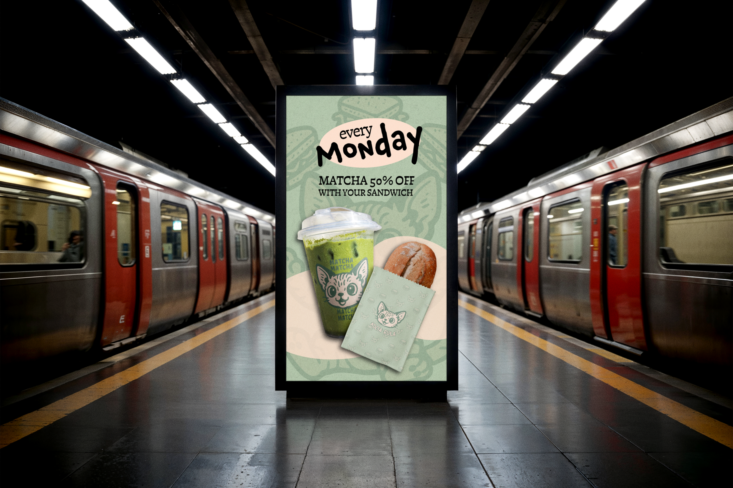
,,Kocia Buła” (Kitty’s Butty) is a playful, character-driven brand created for a small sandwich bar that mixes comfort-food vibes with a quirky, memorable visual identity. The goal was to design a branding system that feels friendly, approachable, and instantly recognizable – something that stands out in a city full of cafés and bakeries, while still communicating handmade quality and everyday enjoyment. At the heart of the brand is a cute, wide-eyed cat character – a cheerful mascot that embodies the warm, welcoming mood of the place. Paired with simple food illustrations (mainly the signature sandwiches), the identity strikes a balance between fun and clarity. All visuals were hand-drawn in a slightly retro, soft-contoured style to capture a sense of lightness and personality.
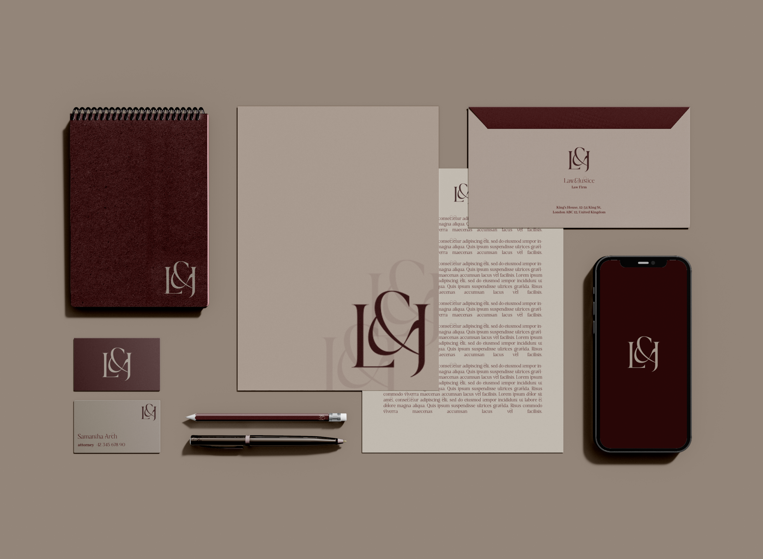
Law & Justice is a minimalist branding system created for a modern law firm focused on clarity, credibility, and long-term trust. The identity is built around a restrained typographic monogram and a limited, warm color palette, emphasizing balance, structure, and professionalism. Rather than relying on decorative symbolism, the brand uses typography, proportion, and material choices to communicate confidence and discretion. Designed to work seamlessly across print and digital touchpoints, the system delivers a consistent, timeless presence that supports the firm’s expertise without visual noise.
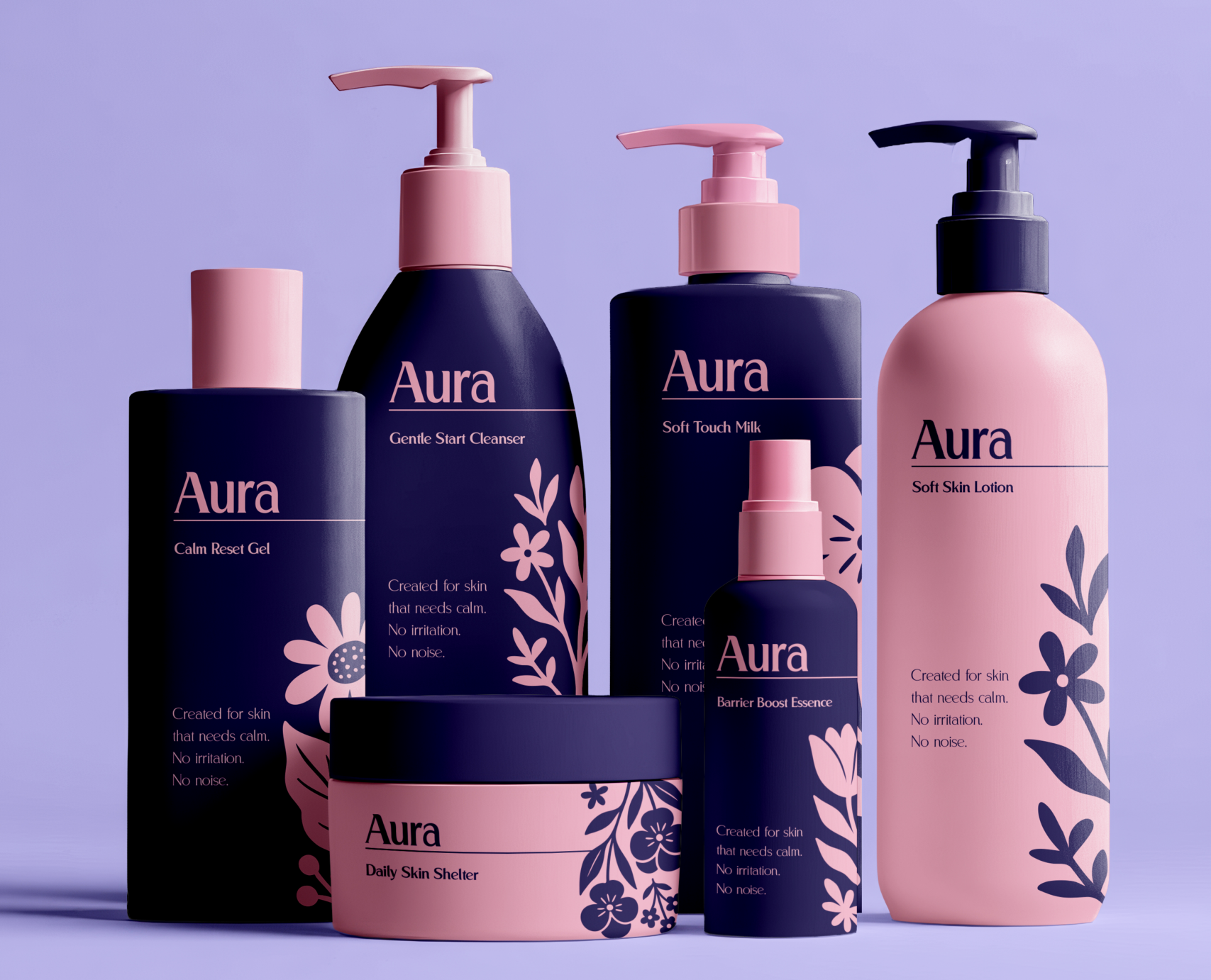
Aura is a skincare brand created for women who seek gentle, hypoallergenic formulas without sacrificing aesthetics, sensory pleasure, or emotional connection. The goal was to move away from the cold, clinical language of pharmacy cosmetics and design a brand that feels calm, modern, and quietly confident. The visual identity is built around softness and clarity. A restrained color palette, subtle contrasts, and minimal compositions create a sense of balance and safety, while still feeling contemporary and desirable. Typography is elegant but approachable – designed to communicate trust without stiffness, and femininity without cliché. Illustrations and graphic elements are intentionally simplified and organic, inspired by nature rather than laboratory symbolism. They function as visual accents rather than decorations, reinforcing the brand’s message of care, comfort, and harmony. Every element is designed to reduce visual noise and support a feeling of calm. Aura’s branding treats skincare as a daily ritual, not a medical procedure. It speaks to sensitivity without fear, and to quality without excess. The result is a cohesive identity that feels gentle, modern, and emotionally reassuring – a brand that looks as good as it feels on the skin.